Consider this: Over coffee break, you blurted out a plumber’s phone number to a colleague after they complained of plumbing problems at home. How did you even manage to recall the digits when you’ve never even used their services? Then, as you drive home that day, you come across a billboard for the plumbing company, and there was the number!
1. Use an Outrageous Idea & Try Humor
Darren Easton, VP & Creative Director, The Cyphers Agency
When coming up with your billboard idea and design, consider a single, big conceptual image with very little copy OR let the copy be the concept, and the image just set a tone. Be outrageous and entertain. Or, use people’s surroundings as they drive to draw them in (e.g. reference the street, building, the sky, clouds, sun, birds, or airplanes). Or, take advantage of digital offerings, technology, and real time messaging (e.g. reference trending topics on social media feeds).

This billboard has a catchy and funny word play on the popular TV show “House of Cards”
Source: Pbs.org
2. Play with a Local Icon or Copy
Jason Markowicz, CEO, Fitness Premier
My biggest tip for a stand out billboard is to focus on the locals. Know where your billboard is being placed, and play with a local icon for copy. It can be a local figure, landmark, or stat. You need the drivers to remember you. Some of the best copy uses plays on a local negative or positive. Experience a wine selection as long as “Chicago traffic.” Service as great as “Cubs Game 7.” Make it stick.
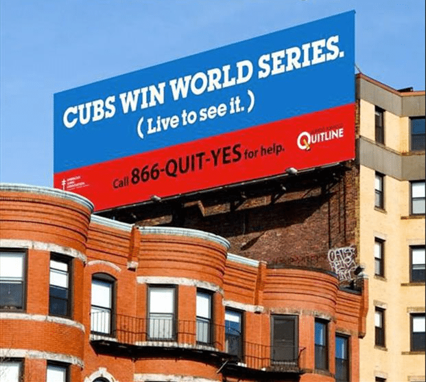
A perfect example of a billboard alluding to a local fact.
Source: dumpaday.com
3. Tailor Your Billboard Ad Based on Where the Customer is Driving or What They Are Doing
Yasin Abbak, Co-Founder, Paired Media
As far as context goes, acknowledge what your customer is doing. For a billboard, the message at the mouth of a slow moving tunnel should be different than a billboard on the side of a fast moving highway. You might reference the traffic, or the beautiful mountains in the distance. With our product, that means acknowledging that the reader is hungry or is using their hands. They might be on lunch break after a stressful morning. These are all opportunities to have a relevant, contextually aware conversation.
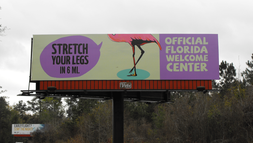
This billboard addresses the long drive to Florida with a fun caption
Source: visitfloridablog.org
4. Test How Your Ad Looks From a Distance
Martha Bartlett Piland, President & CEO, MB Piland Advertising + Marketing
The best thing your designers can do is NOT just look at the design on their computer screen. To really evaluate how effective it will be in real life, they need to simulate how it will be viewed when it’s posted. They should print it out, trim it and post it on a wall – then step way back. Look at it from at least 10’ – 15’ away. Then move to different positions in the room and view it again. Then look while walking. This will make it much more obvious if the font is readable, if the image is understandable, and if the message is being conveyed when people are driving by and seeing your ad from a distance.
5. Don’t Include a Photo of Your Team
Natalia Luneva, Healthcare Practice & Marketing Consultant, Practice Secret
For crying out loud, do NOT include a photo of your team. How many times have you passed by a medical billboard with a bunch of doctors taking 2/3 of the billboard space and then you wonder what they were trying to say? Show your design to a group of 20 people for half a second and ask if they understood what it was about. If you don’t get a clear answer, then roll up your sleeves and get back to the drawing board. The message is most important! Don’t let it get buried by an image.
6. Know that Digital Billboard Ads Need More Maintenance
Skye Callan, Business Strategist, MeetGeraldine
Consider the medium of the billboard: I’ve designed ads for digital billboards that ended up having a negative impact on my brand because the owner of the billboard didn’t maintain the billboard well. Dead pixels or the blue screen of death messed with my designs or caused my ad to not be shown at all (some billboards often have these issues, and viewers may have a negative association with that billboard; thus, you may not want to utilize it in your campaign). Along those lines, some audiences may have specific feelings towards digital billboards vs. static ones (something to consider).
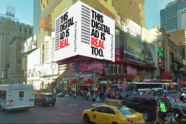
A digital billboard ad needs more maintenance than a traditional billboard ad.
Source: si.wsj.net
7. Use Memorable Contact Details
Max Cron, Creative Strategy Director, Online Optimism
Having a successful billboard relies on two factors: the attention grabbing factor and the call to action factor. This usually is in the form of an image and text. People don’t have enough time to write down a phone number while driving, so stick to words. A funny or eye catching photo and a catchy email address, hashtag, website, or vanity phone number makes the perfect billboard.
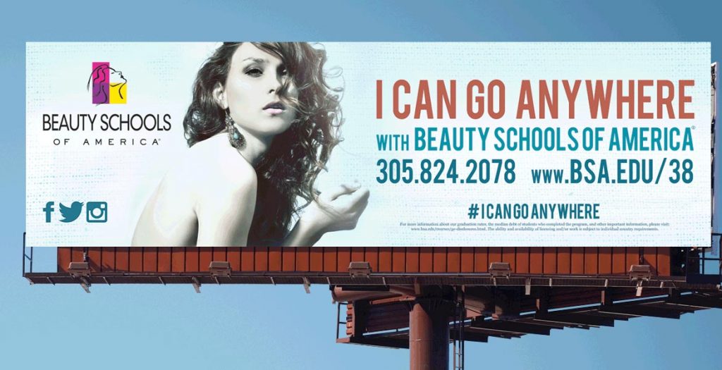
A compelling hashtag makes this billboard easy to remember.
Source: Swaggergroup.com
8. Use vanity phone numbers
Gavin Graham, Writer, Fit Small Business
Vanity phone numbers are an economical way to help customers that drive by your billboard to remember your phone number. The time constraints involved in billboard advertising requires that your message be short with maximum recall, and vanity phone numbers are a perfect solution. They have the ability to tell your audience who you are, what you do and how to reach you in 12 characters or less (e.g. 1-800-NYPLUMBER). If you want to get one of your own, check out this great tool from Grasshopper. It allows you to plug in your desired word and will give you a variety of options to choose from. Once you’ve found a number you like, you can purchase it directly from them.
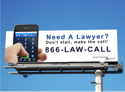
Vanity phone numbers are easy to recall, perfect for billboard ads.
Source: seoforlawyers.pro
9. Dare to Be Quirky to Build Brand Awareness
Matt Peterson, CMO, Jive Communications
Last year we decided to try out an interesting theory on our billboard campaigns that was risky, but different. We decided to do plain text. No images. No illustrations. No stock photo. No designs. No colors. Black text on white backgrounds. We wanted simple statements that could be classified as bad sales pitches. The directness of the message and the ridiculousness and absurdity of paying to do a plain text billboard would be our hook.
We used messages like “please buy a phone system from us. -jive.com” or “phone systems for calling people and receiving calls. -jive.com.” Whether people loved them or hated them, we definitely built brand awareness. Awareness that actually brought dozens of new customers to our doorstep.
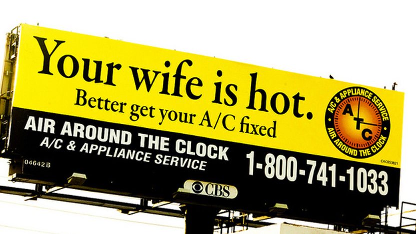
Quirky message to get attention and build brand awareness.
Source: coralspringstalk.com
10 Pick the billboard location base on your budget & target audience
Maggie Aland, Marketing Editor, Fit Small Business
Billboard advertising can cost from $250 in rural areas to $4,000 in small- to mid-size US cities, which is why one of the most crucial decisions when setting up a billboard is the location. Location determines the kind of reach your ad will get. How much circulation will your billboard get from that location? Does the demographic in that location match your target audience? These are the kinds of questions that you need answered when choosing where to put your ad. Restaurants and shops, for example, often advertise next to the closest major highway. These ads are extremely actionable, since they’re promoting something that is just minutes away.
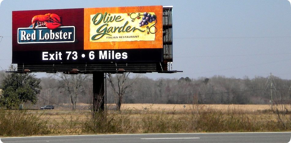
A restaurant billboard ad at a highway appeals to hungry travelers
Source: morelandsignsinc.com
11. Make Sure The Text on the Ad is Legible
Reuben Kats, COO, Falcon Marketing,LLC
Billboard advertising is fast paced. Your target audience has no time to read long lines of text, which is made worse when the text doesn’t stand out enough to be easily read. When putting an ad on a billboard, use dark colors in the background and create layers that slowly take the contrast out from the background, so the image on the billboard shows up clearly. Wrong decisions on simple things such as color can cost you sales opportunities, so it is important to know how to make your caption stand out and quickly get your message across to your audience.
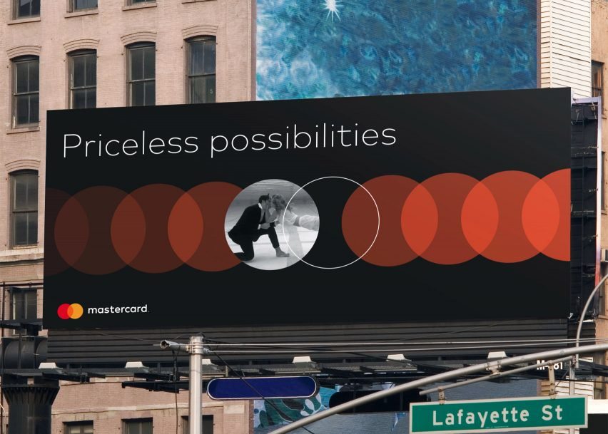
A billboard with a dark background and easy to read white text.
Source: static.dezeen.com
12. Keep Your Ad Simple to Help People Remember Your Message
Robert Evans Wilson, Jr., Speaker-Humorist, Jumpstart Your Meeting
I recently saw a billboard ad on I-75 South heading into Atlanta, Georgia. It was exciting to see — like spotting the nearly extinct ivory-billed woodpecker. But this was no rare bird; it was a perfect ad. Perhaps just as rare, it was just five words in black print against a pale purple ground. No design. No graphic device at all. No need; the words said it all. Two of those words were even from the top ten list of words that generate the strongest emotional response and help people remember your message.
13. Consider hiring an expert
Jeremy Marsan, Editor/Writer, Fit Small Business
A few extra hundred dollars spent on a professionally designed billboard should be worth the expense considering you may have to invest thousands of dollars for billboard ad space. Hiring an expert avoids design pitfalls that could hurt conversions from your ad – or worse, hurt the reputation of your business. There are a number of design companies that offer competitive rates that can easily fit a smaller budget as long as you take time to look around.
14. Present a clear call-to-action
The measure of an effective advertisement is when it leads to conversation and engagement. You need to be clear about what action you want the customer to take — a phone call, an email, a visit to your website, or a drive to your business. An immediate response is ideal, but if your product can’t lead to a quick detour, the next best thing is to be memorable enough to have your audience want to contact your company as soon as they get home. For nearby businesses, billboards can serve as a great road map to location. They can double as roadside attractions and can build anticipation, making them unforgettable to any traveler on the interstate.
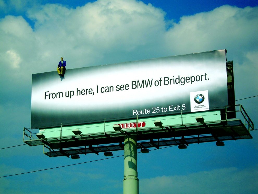
This billboard attracts attention and creates anticipation for the product.
Source: theafterlifeepitaph


