Outdoor advertising is any type of advertising that reaches the consumer while he or she is outside the home. This is in contrast with broadcast, print and Internet advertising.
Billboard ads, therefore, are focused on marketing to consumers when they are in transit, waiting (such as in a medical office), and/or in specific commercial locations (such as in a retail venue). Outdoor advertising formats fall into four main categories: billboards, street furniture, transit, and alternative.
Nowadays we have a wide range of different types of advertisement and one of them is OOH (out-of-home media advertising) which is also known as outdoor advertising. Everything you can see when you aren’t at home that promotes something belongs to this type.
We often call people in 21st century consumer society. Today we can’t imagine our lives without many things which were invented only half a century ago and of course manufacturers are perfectly aware of this fact.
They use advertisement in every way possible, it’s everywhere: in magazines, on TV, on billboards, city lights, and in your smartphone. The thing is that despite it’s so widespread it becomes less and less effective.
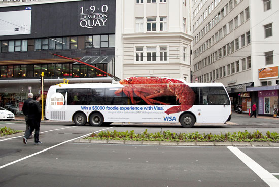
Fifty years ago there were a few companies advertising their goods but now there are thousands of them and it becomes harder to catch consumer’s attention.
Types of Outdoor Advertising
Advertising companies all want to succeed in the promotion of companies they represent and good those companies want to sell. one of the best ways to achieve the aim is to use outdoor ads.
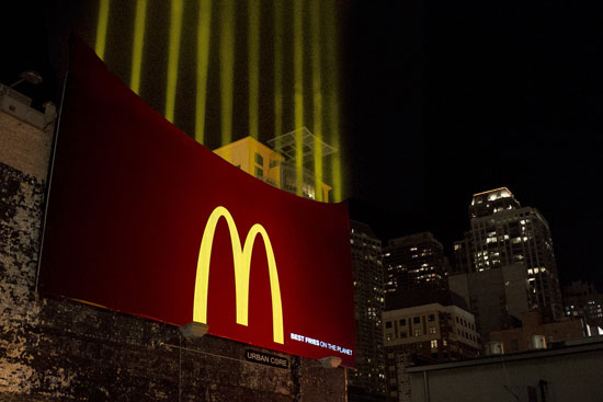
Benefits are innumerable: people can see it even if they’re not engaged with the business you expect them to do. A person can simply stroll along the street and look on the wall and voila you have a new customer or at least potential customer, he or she doesn’t necessarily need to buy a magazine or use social media to see your advertisement.
The main types of outdoor advertisement are:
- Mobile billboards
- Billboards
- Ambient media
- Bus stops, telephone booths
- City transport (taxi, buses, etc.)
Tips for outdoor advertising
Six Words or Less is Ideal.
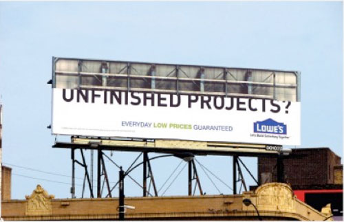
If we consequently decide on outdoor advertisement, we should bear in mind that we’re pressed with time to get people interested. As most studies in the field of advertisement show – all we have is 6 second not more or less.
So we should think of mottos, massages and slogans consisting of 6 words approximately. You may think that if the word is quite bulky you can split it into two and the result will be the same as in Math, but as we’ve mentioned above, only six words is what we need.
This fact leads us to an obvious conclusion that if you deal with something more complicated than the Nike advertising with “Just do it” you should avoid outdoor advertising at all and look for more suitable format for your brand.
Get Noticed, But Don’t Be a Huge Distraction.
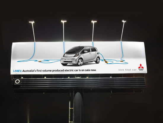
Making a billboard is quite tricky. The advertisement should promote goods and services in every way possible but it shouldn’t be harmful, though. Here’s what I mean. Drivers, pedestrians and other people on the street are usually the target audience in an outdoor advertisement.
Your billboard ads should be bright and attractive, they should stand out among other and catch the eye of a costumer, but not lead to car accidents, as it sometimes happens.
During short history of advertisement, we can see many examples when, for instance, advertisement of women’s lingerie promoted by almost naked women distracted driver’s attention and caused accidents.
This is Not the Place for Direct Response.
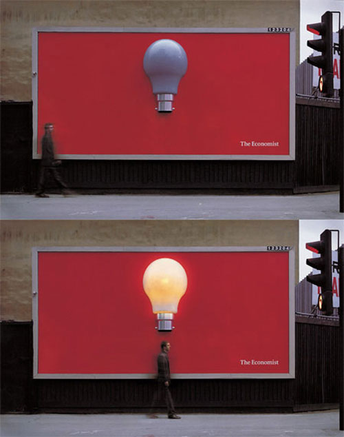
Different mediums of advertisement serve for different purposes and information to be delivered. It’s a big no-no to place some precise data on the billboard ad like phone numbers or email addresses.
Such things usually only distract attention from the main massage and most people will not have time to write down phone number or web address.
Remember that outdoor advertising is secondary, it supports main campaign and is not to deliver all the information about brand or company at once. If you really need to inform costumers just use other types of advertisement which are supposed to deliver such details.
Be Smart, But Not Too Clever.
If you want to grab attention your billboard should be really special and look smart, of course. But don’t mix it up with being too complicated. It’s a billboard and not Encyclopedia Britannica.
Summing up the things we’ve mentioned above here’s what we have: we should put the best slogan ever into 6 words for 6 seconds a person has to read them and if you make only 6 words too complicated to understand you’ll definitely fail in your advertising campaign.
The target group is average consumers they have different occupations and interests, that’s why there’s no use to cram your billboard advertising with tangled bookish metaphors from “Pride and Prejudice”, since a worn out nurse after a shift won’t really care and you still want to catch her attention so think of something appealing and… understandable.
The More Billboards, The Better.
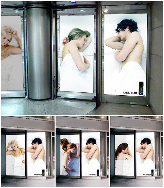
There’s no doubt advertisement isn’t cheap. Outdoor marketing is even more expensive than other types of advertisement. The story gets tough when you realize you need more than one billboard, because one isn’t effective at all.
All billboards have a special rating called GRP or Gross Ratings Points. The level of GRP depends on many factors which influence the final impact of your advertisement. Of course, the price rises simultaneously with the figure of GRP. Price will be based on such factors as traffic and visibility, area and other.
Don’t Say It, Show It.
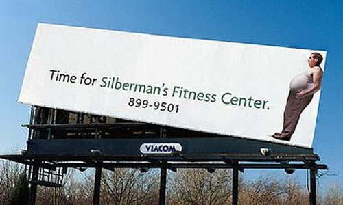
We have much space but still not enough to say many words. But why should we? Eventually, billboard is a visual type of advertisement so it should be really eye-catching. The difference between billboard and a leaflet is not only that the first is a big copy of the latter.
The real difference is in unmatchable opportunity to showcase performance that a small piece of paper cannot allow to show. So think of 3D effects, of some creative ideas and pictures which interact with surrounding and create memorable effect. Don’t be afraid of crazy billboard ideas. Really creative billboards often grasp attention.
Avoid Repetition of Any Kind
At a first glance, it seems that you have much space and can place there everything you want. The reality is different. If you repeat anything in any way it will be waste of money. A huge sum of money.
If there’s banana on your billboard you don’t need to print the word banana above, it’s obvious and you repeat things by wasting the place you have to promote something. Billboard advertising effectiveness rises if it’s concise.
Keep It Simple, Stupid
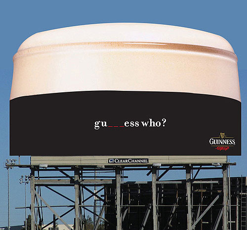
If you want to create a billboard remember it is not a book or even a leaflet to read. We usually see it while crossing the road or when we stop at the traffic light so it should be like a flash fast and impressive and memorable, of course.
If you want to promote something by using billboard avoid long metaphors and all the range of layouts proposed by advertising company. The shorter and informative it is, the more it looks like a flash fast and effective.
Be Wary of Logo Size
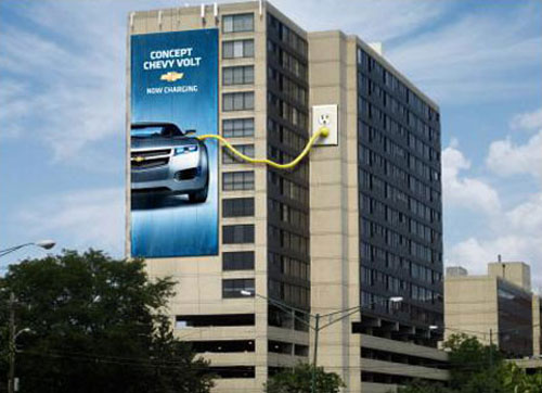
Companies pay a lot of money to promote their goods and the first thing they expect to be showcased is definitely what they produce. But the thing is that if they fail to place the logo of right size the whole campaign might fail.
If the customer sees the product but doesn’t see the producer, what’s the reason of advertising then? Here’s the dilemma. If the logo is too small it won’t be noticed and we literally lose the reason of advertising and if it’s too big it distracts customer’s attention from the main picture or massage. That’s why it’s so important to find the happy medium in logo size.
Do The “Arm’s Length” Test
If you have taken into consideration all the pieces of advice given above and almost sure you got a perfect billboard, we have a final test for you to make sure everything is really fine and you achieved your goal.
Print you billboard design sized as a business card. Does it still correspond to all the criteria above? If the answer is ‘yes’ congratulations, if ‘no’ just take some more time and commit some changes in order to get really powerful tool of advertisement.
Ending thoughts on billboard ads
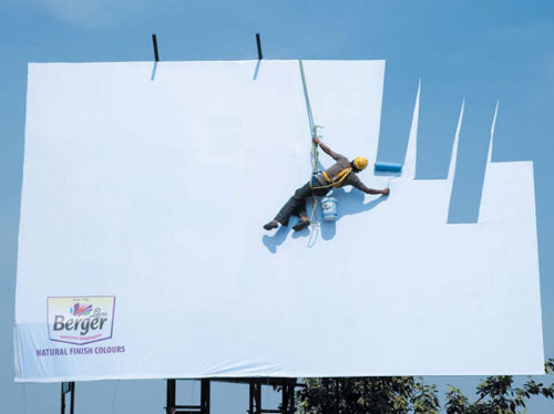
With social media, smartphones, gadgets and other things around, it’s quite hard to grasp consumer’s attention in the street. They rarely raise their heads to look up and it makes the task for you more difficult.
This doesn’t mean you should give up so easily. Most of the information people perceive is visual and the image of a bright billboard in the street is definitely more vibrant and eye-catching than a small icon on the screen of a smartphone or a tablet.
Moreover, billboards are massive, they’re everywhere. If you choose them you don’t place one or two, at least 5 or ten. You can also use different effects like 3D to make the billboard even more eye-catching.
Just bear in mind main tips to create a really successful tool for promotion and you’ll be surprised how powerful outdoor advertisement can be even in our times.